

Earnify - British Petroleum
Designing Engagement Through Routine and Reward
What am I showing you?
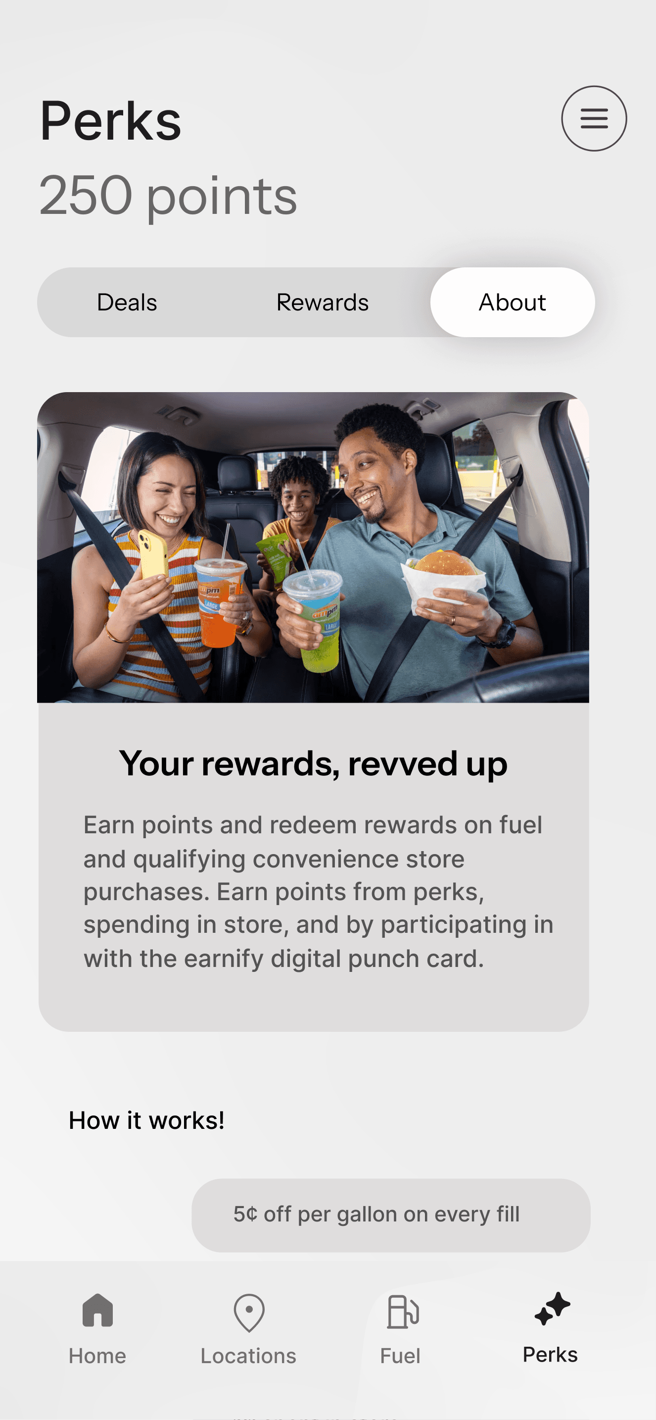
BP earnify is a mobile app designed to boost in-store engagement at BP convenience stores through a variety of rewards. As a team we were tasked with increasing in-store purchases at BP convenience stores by enhancing the Earnify app’s reward systems and user experience. Our team took on this challenge and designed the app to transform everyday visits into meaningful interactions through time-sensitive and purpose driven features.
My Role
Product Design - user research, visual design
Team
Katie Davis
Anna Xie
Briley Wehr
Ariana Chavez
Timeline
Jan - May 2025
Tools
Figma, Trello, Excel
The Problem
Disconnected Touchpoints; Low In-Store Engagement
While BP’s Earnify app offered rewards and deals, it didn’t give users a strong enough incentive to engage beyond getting fuel. The deals felt static and the experience lacked urgency or personal relevance to the user and especially the younger audience. We were competing with the users indifference.

The Solution
Closing the Gap Between the Pump and the Store
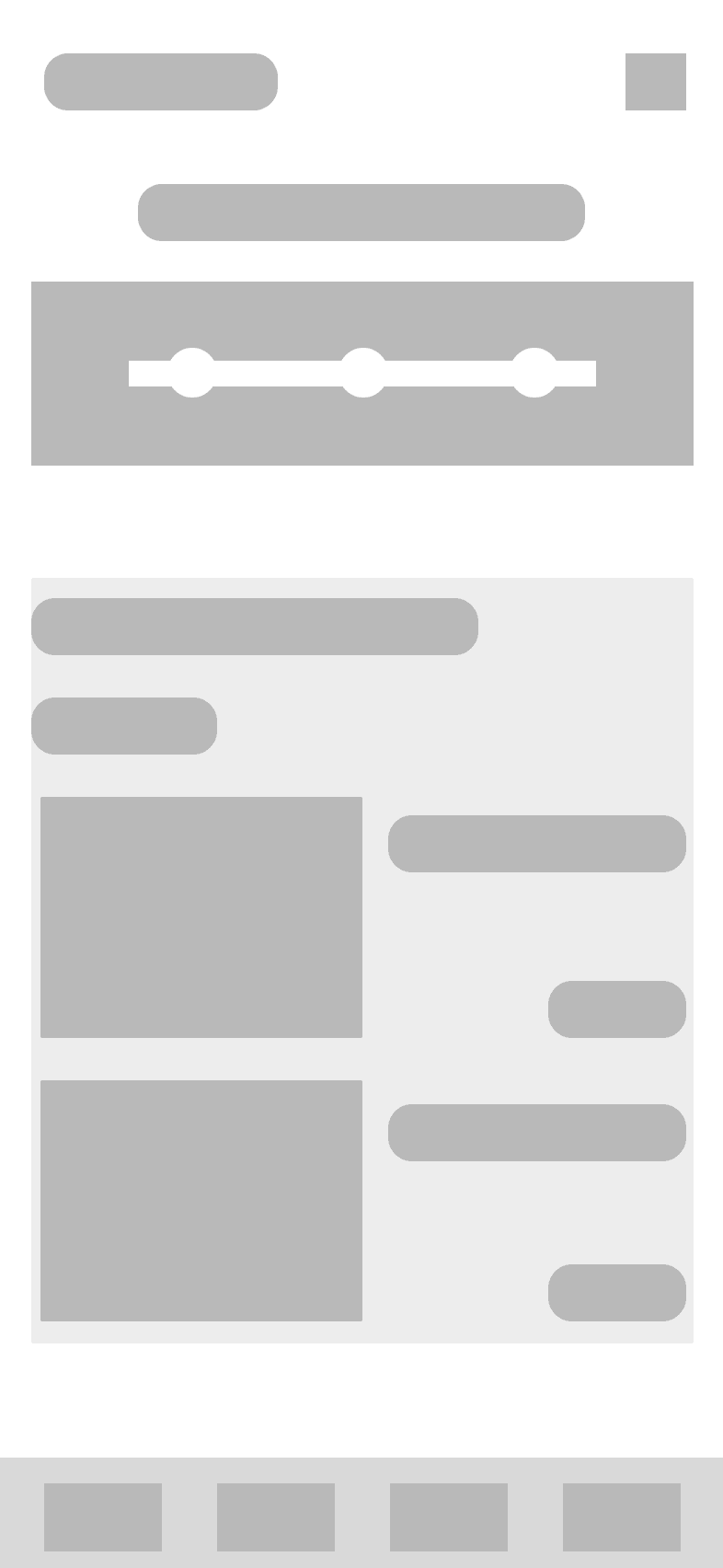
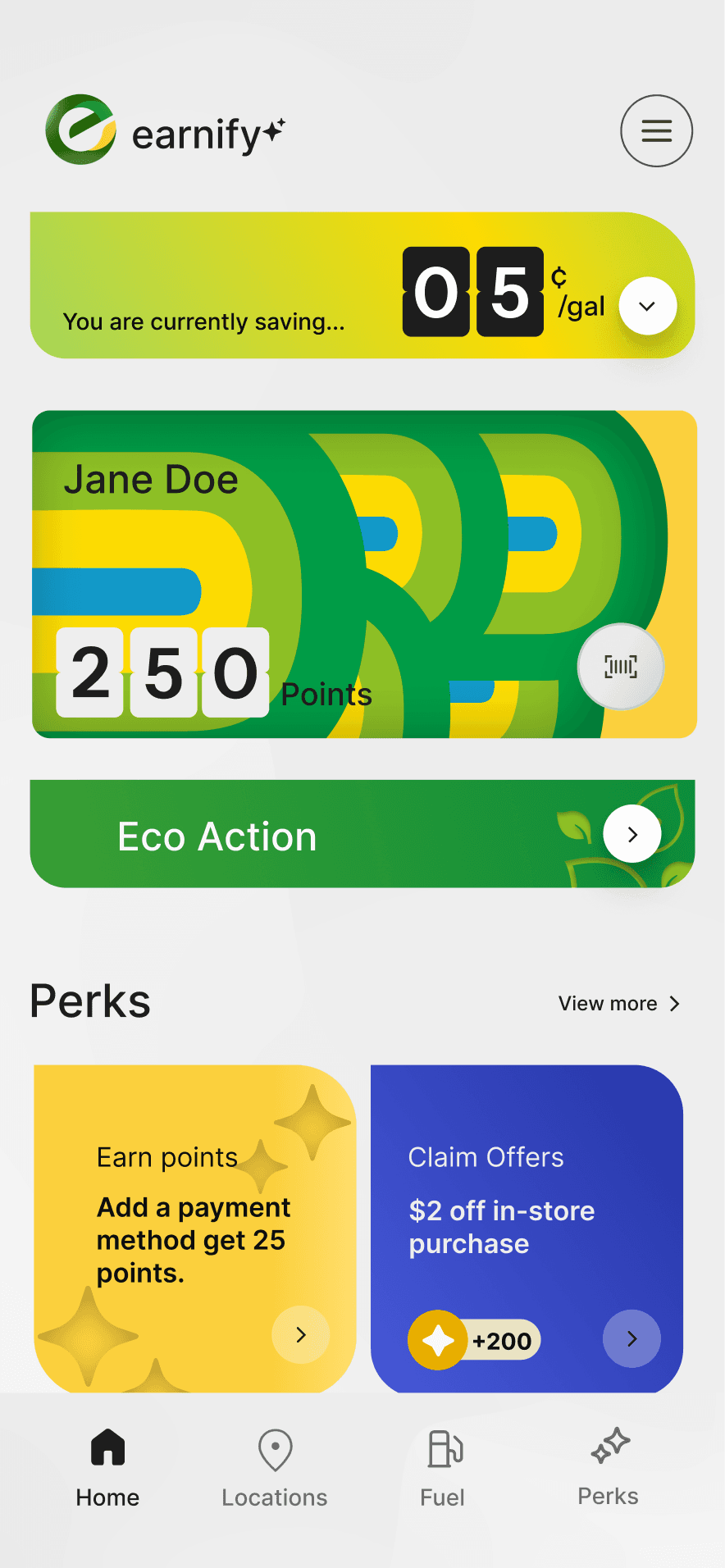
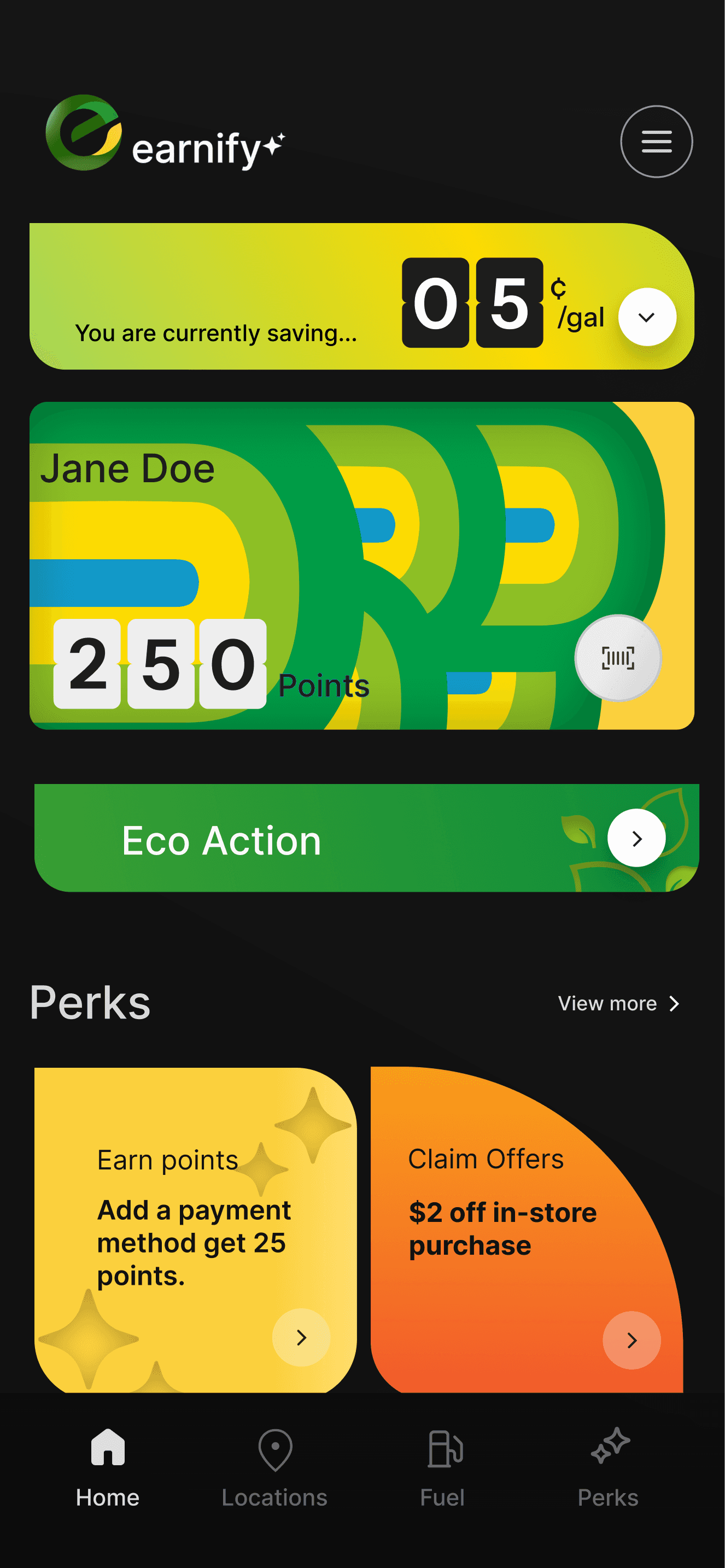
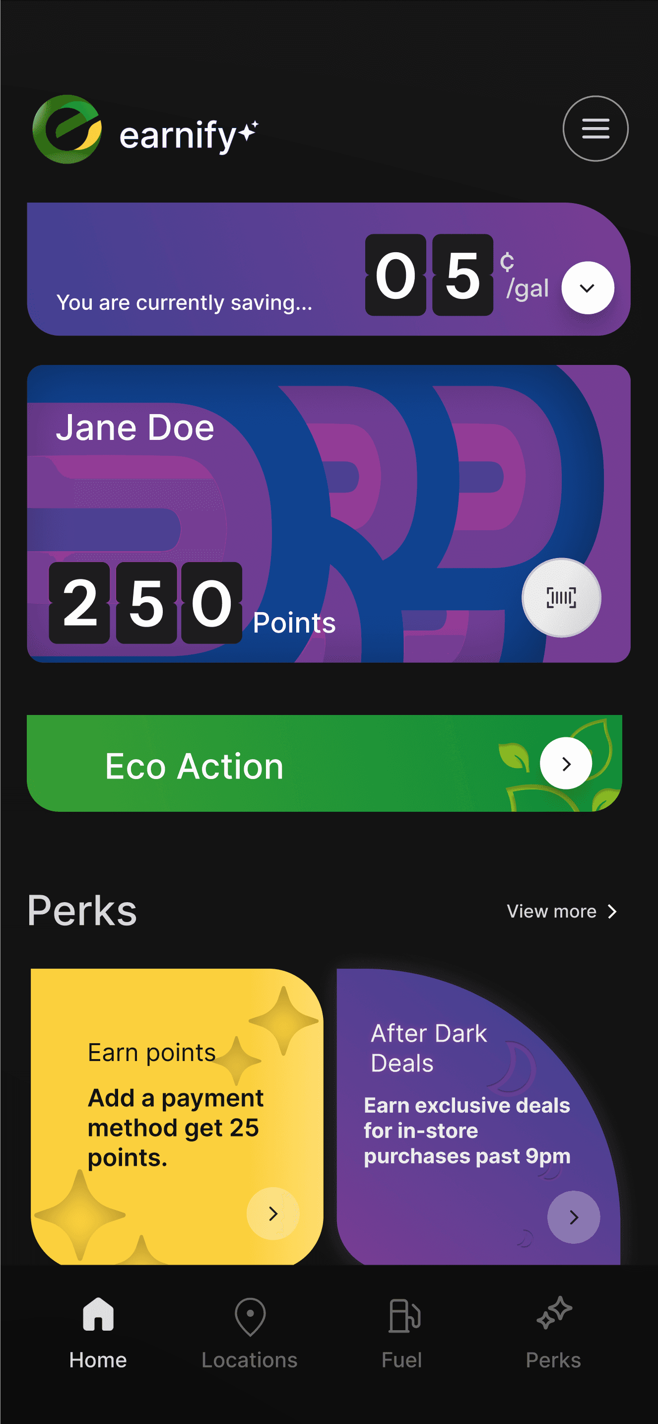
The connection between opening the app and stepping into the store was not strong enough for younger users. So we introduced time-sensitive deals that activate at night, eco actions that align with Gen Z values, and a digital punch card that gives users an incentive to purchase in-store items.
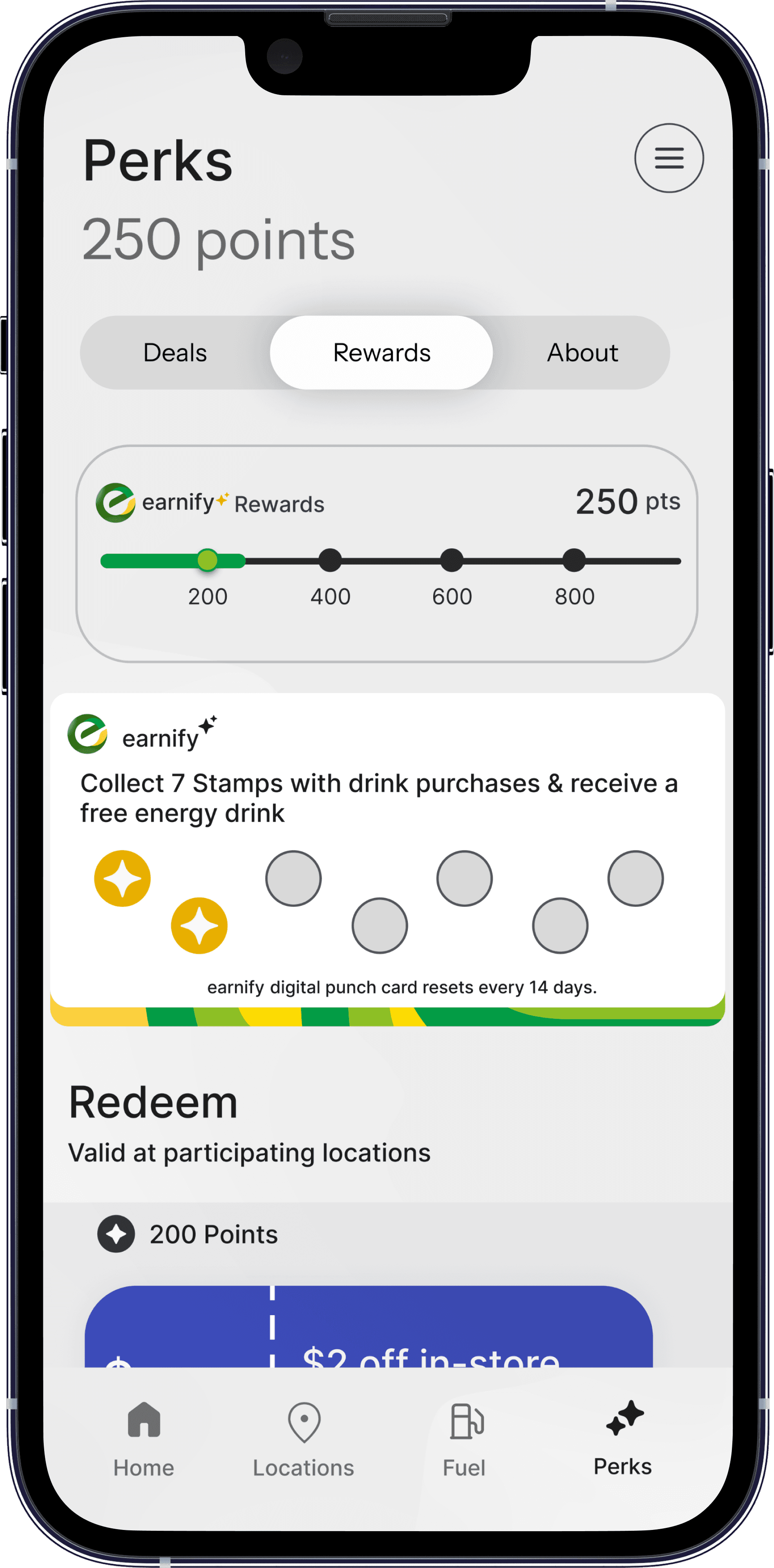
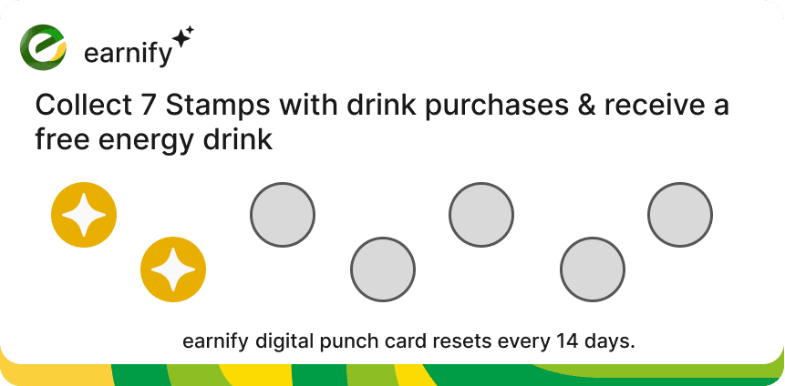
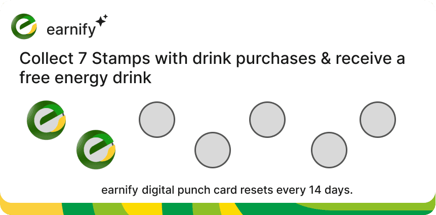
Digital Punch Card
A digital punch card designed to reward repeat in-store visits, helping the user turn small purchases into progress users can see and interact with.
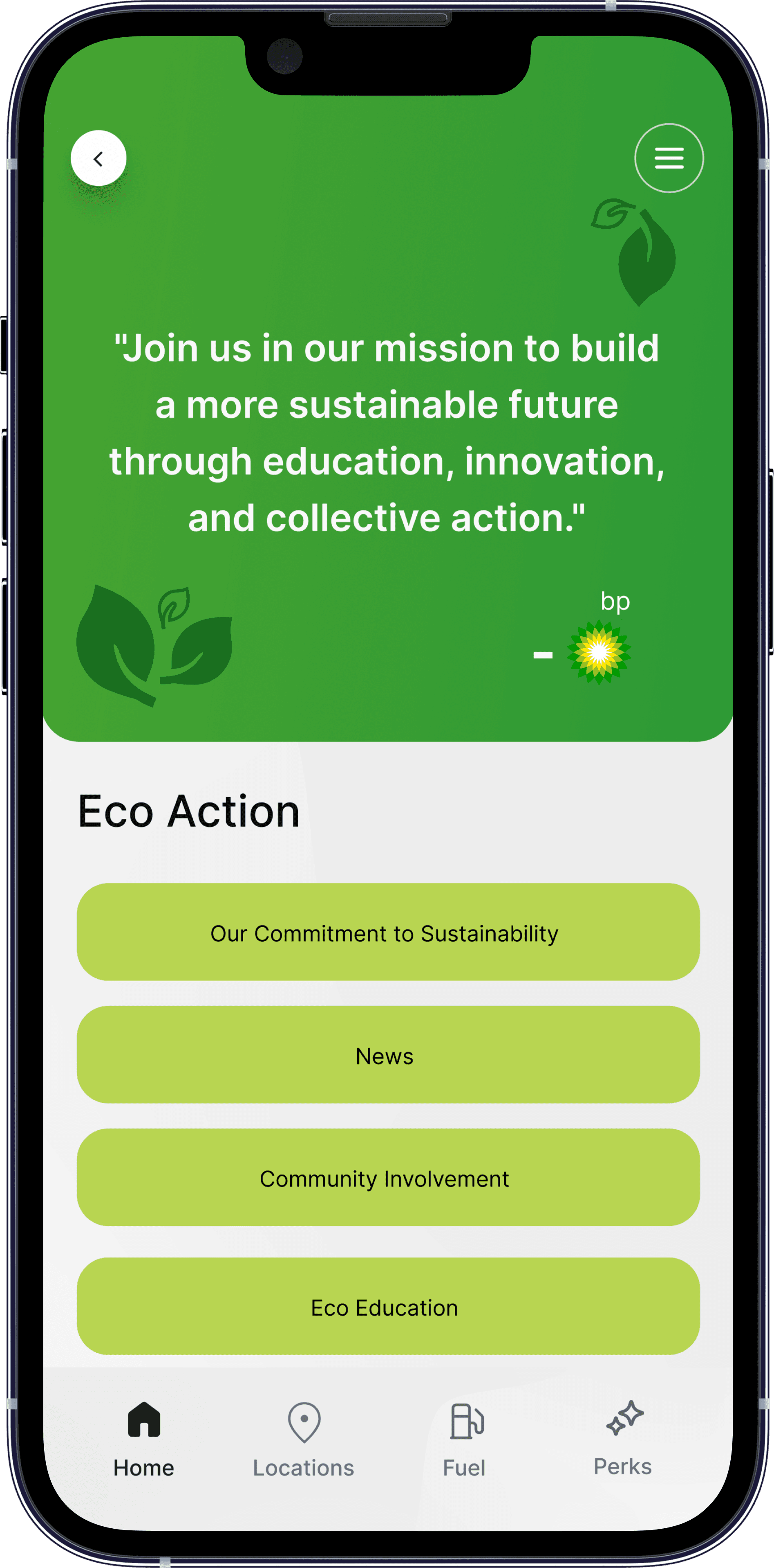
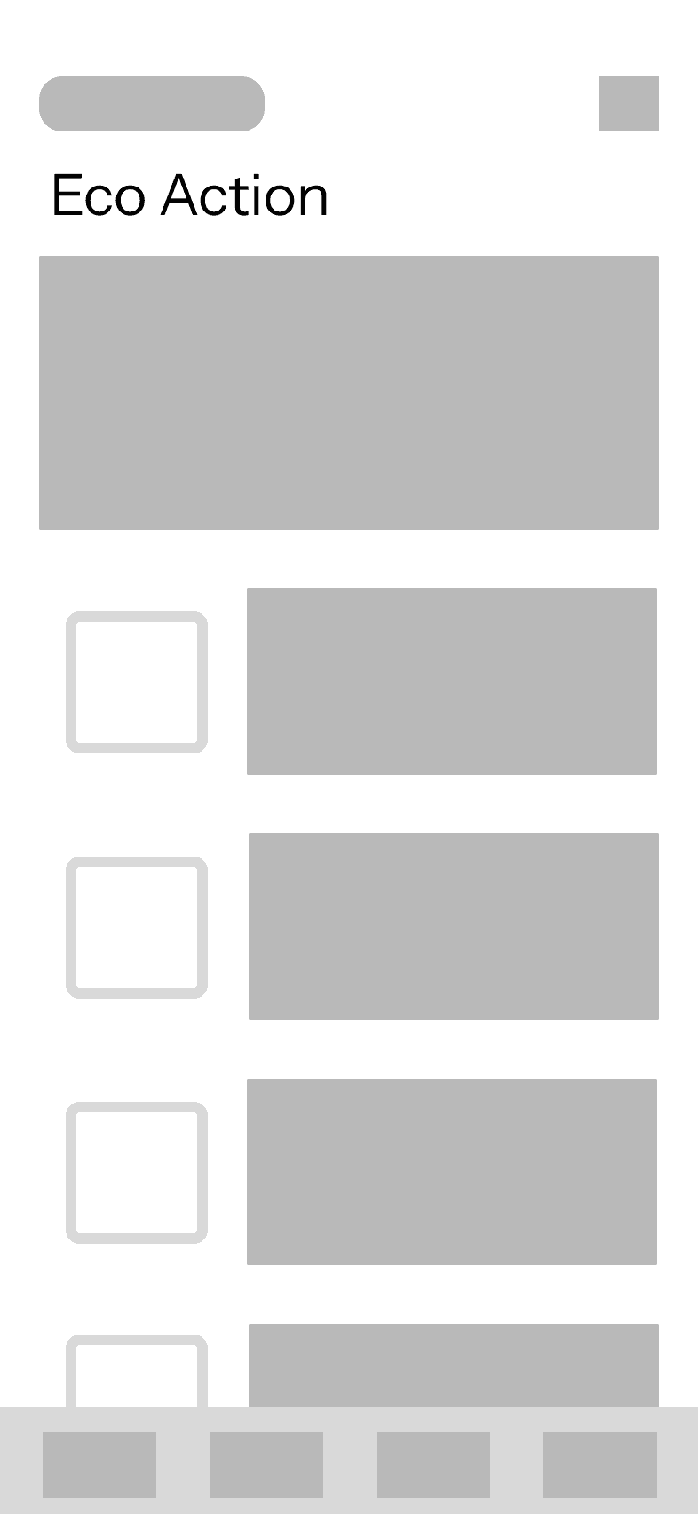
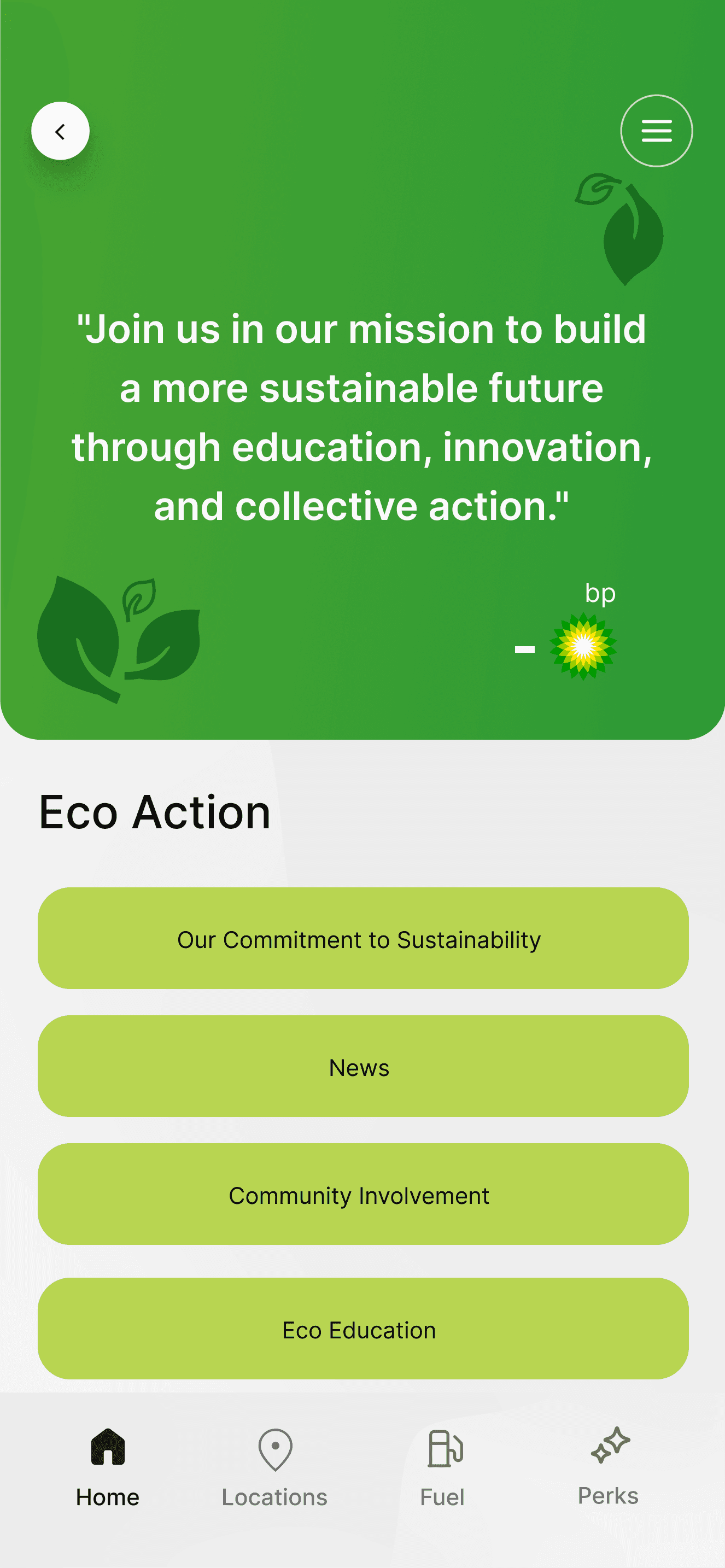
Action with Impact
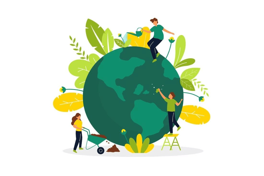
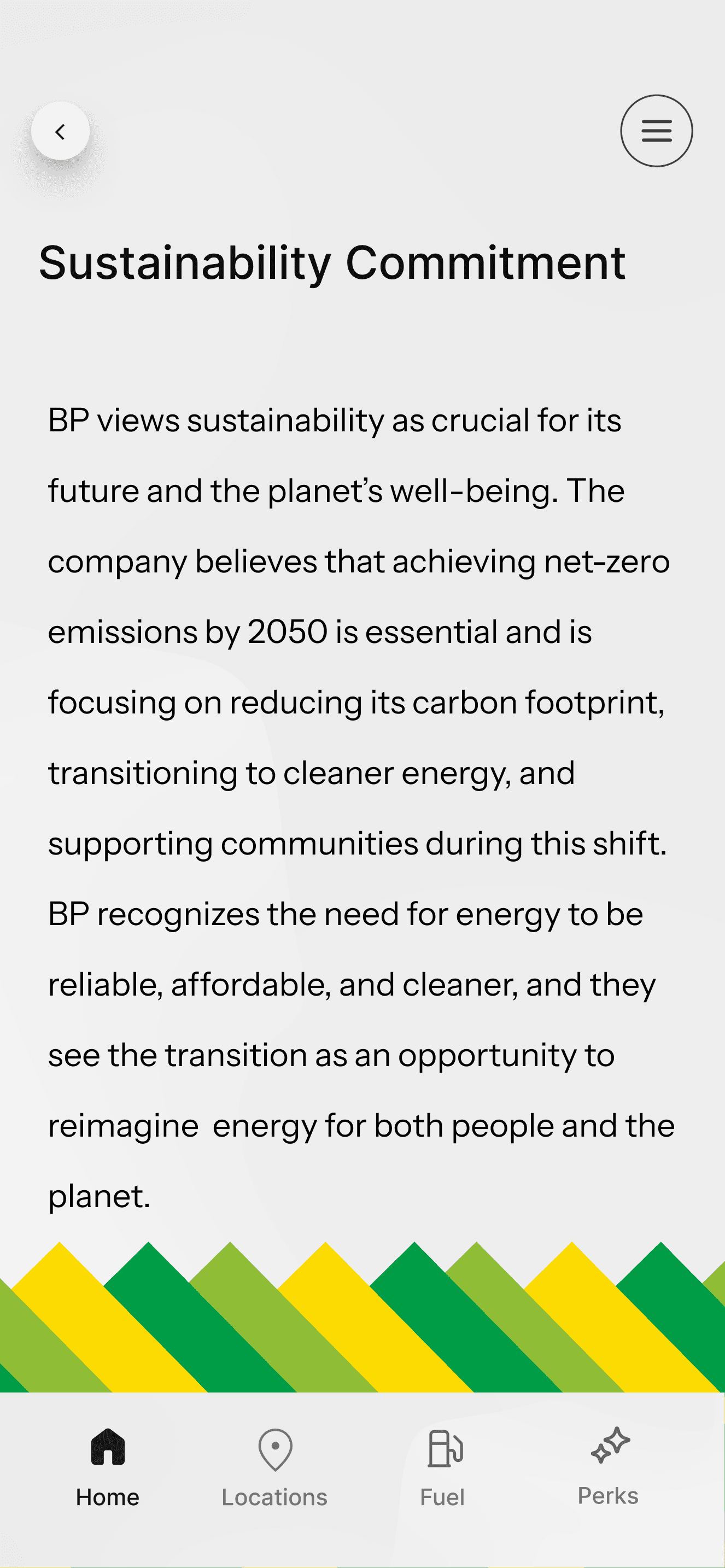
The sustainability button lets users donate, educate themselves, and learn about BP’s commitment to sustainability.
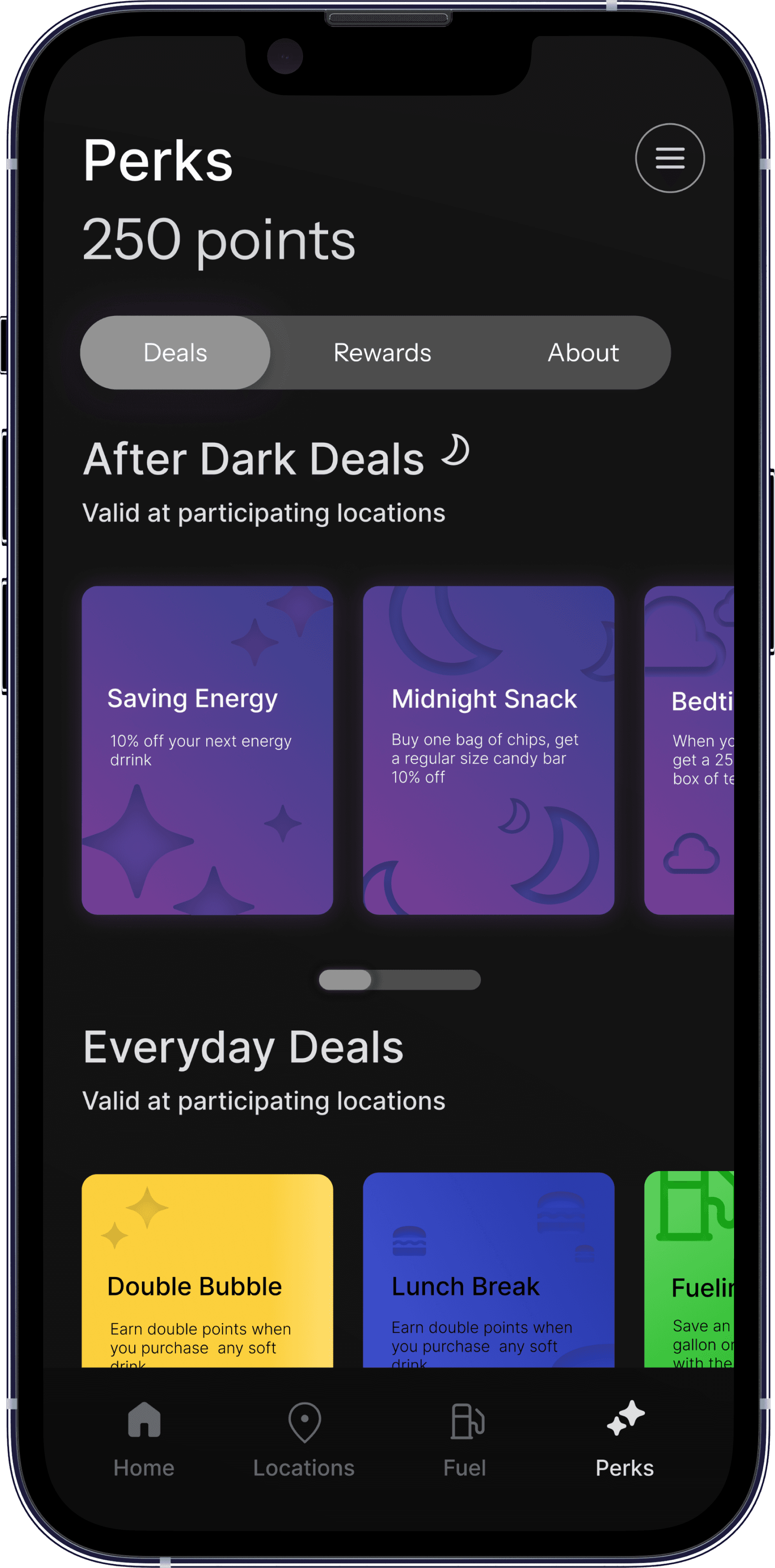
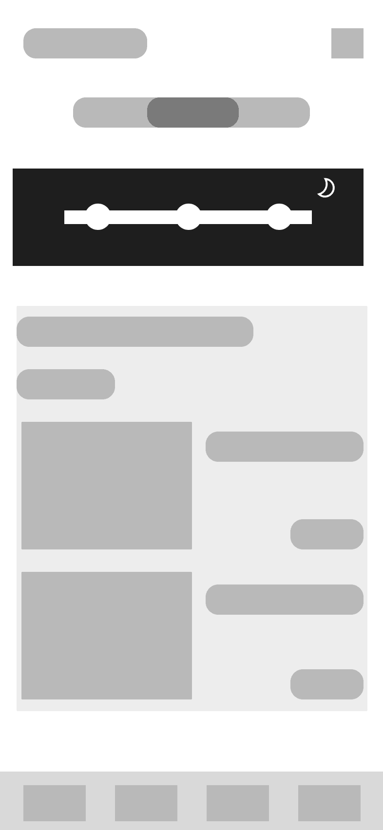
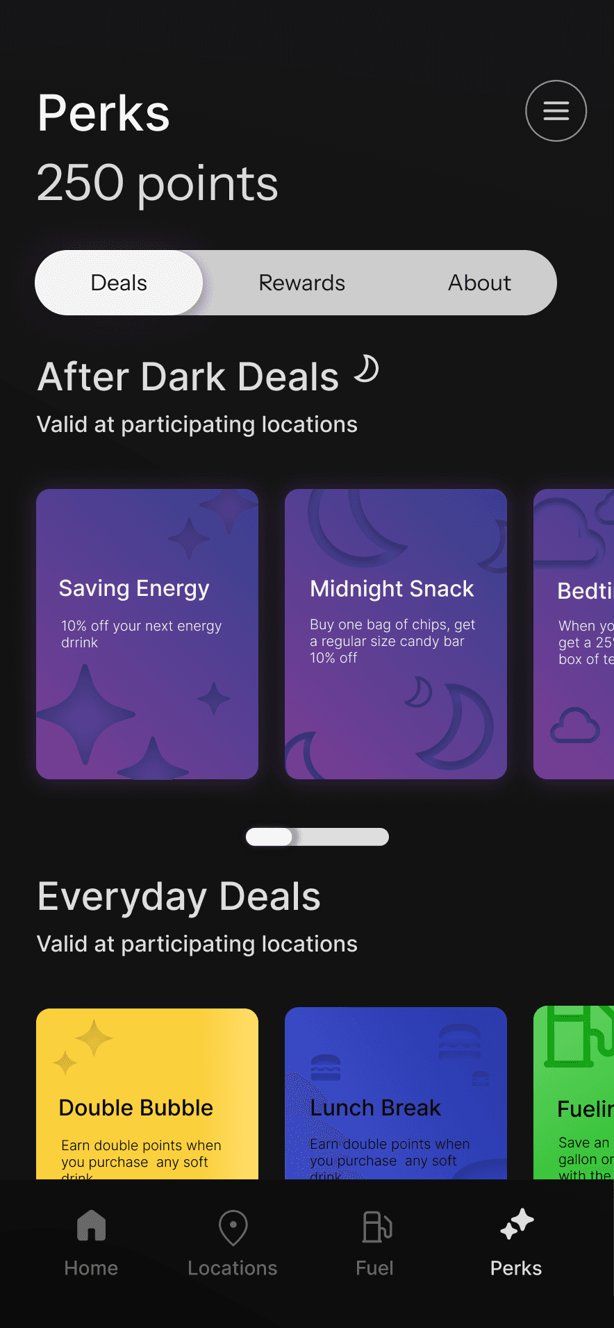
Deals After Dark
Exclusive deals that activate during the evening hours to incorporate those who tend to find themselves at the gas station at night.
01 DISCOVER
What stops young adults from walking into the store?
We explore both qualitative and quantitative data through published articles to understand how younger consumers interact with convenience stores. Also, we conducted our own trend analysis based off the information we gathered.
Secondary Research


About our 133 Respondents...
Our team conducted a survey to gather data around behaviors and overall thoughts around general convivence stores. Our goal was to uncover recurring concerns and understand how users perceive in-store experiences. The results not only helped us identify common hesitations and habits, but also lead us in the direction of our design.
Survey

81.2% of respondents are between the ages 18-23.
68.4% of the respondents are students

72.9% of respondents have a job
18% of participants say they consistently visit convenience stores
18%
82%
42.1% of students say they would visit between 5:00pm - 11:00pm
42.1%
57.9%
When asking “What do you value most when making a purchase?" 46% of respondents valued convenience
Convenience
Price
Quality
No Preference
0
20
40
60
80
Results
User Interview
At the end of our user survey we included an option if the user wanted to be contacted for a user interview, from those that said yes we interviewed 5 participants. These conversations helped foster a deeper insight for understanding why so many students choose to not visit convenience stores.
-P01
-P05
-P02
Define Convenience
What suggestions would you give to improve convenience stores?
What do you like about joining loyalty programs?
“I think [loyalty programs] just got to have some kind of incentive, like free stuff or discounted.”
“Open all the time, has the items I want, and close in proximity”
“...eco-friendly packaging and sustainability.”
Expert Interview
Before ending our interview process we decided to conduct an expert interview with the Director of Product Management at [redacted company]. Their feedback helped us gain additional insights and strategies to gain more clarity on our decision making down the road.
Insights


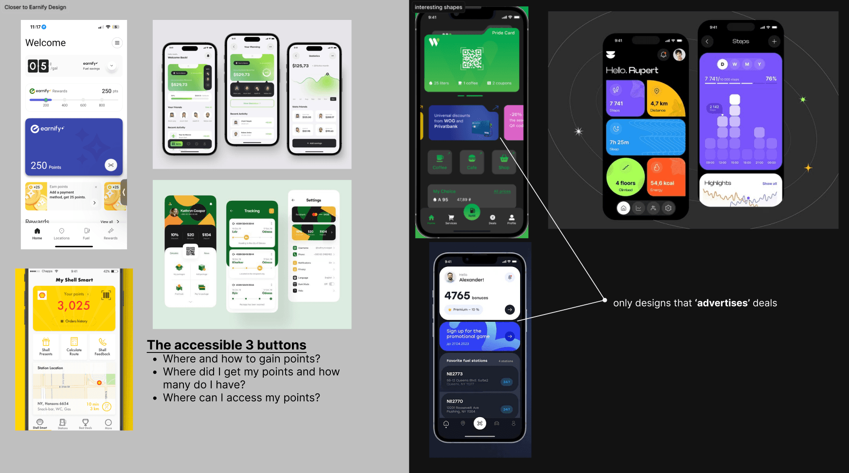
Competitor Analysis
To better understand the landscape of loyalty driven convenience store experiences, we analyzed several major gas stations. Each offered unique features like pre ordering, pickup, and bonus rewards. By understanding what worked and what didn’t, we were able to position Earnify as a stronger rewards app.
Limited appeal to everyday customers
No loyalty rewards, just daily deals
Lack of eco friendly procedures
Wide variety of hot foods
Food customization
Daily deals
RV hookup reservations
Bonus rewards
Store amenities map
Pick-up (preorder food)
Location summary
Menu browsing
Lack of urgency on rewards
Cannot combine store items and hot items in app
Lots of info, no form of engagement
Key Insights
In-Store Hesitation
Values-Driven Engagement
Reward System Confusion

Young adults reported rarely going inside convenience stores unless they had a clear reason, often citing lack of urgency or an underwhelming experience.
Creating a feature that gives the user an incentive, sense of urgency, and provides a good enough reason to step inside the store is how we might address this issue.
Creating a way for users to see BP’s transparency through their ecofriendly actions and get users to feel more aligned with BP’s broader mission.
Creating a visual point-based rewards system that makes progress feel achievable through specific incentives can help make users lose that confusion.
Survey and trend data showed that Gen Z places high value on brands that reflect social and environmental responsibility, especially when it feels authentic.
Participants frequently mentioned that loyalty programs felt unclear, or like ‘background noise’ unless there was an effort to be seen.
02 EMPATHIZE
Understanding the users motivations and expectations.
User Persona
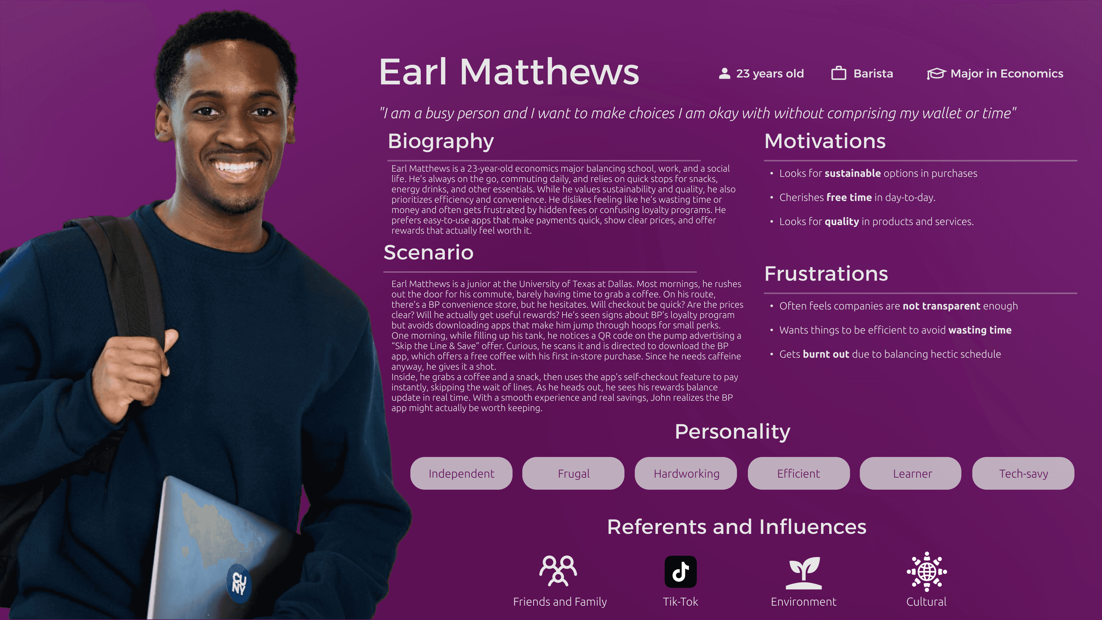
We created a persona that captures the behaviors, motivations, and frustrations of our audience: young adults who go to gas stations but rarely go inside. From this we defined a problem statement that would be the anchor to our design decisions.
Problem Statement
We aim to provide a convenient, trustworthy, and engaging experience that helps users save, make informed choices, and enjoy exclusive dynamic rewards.
03 IDEATE
Translating insights into actionable concepts
After Dark Deals
What it is: App-only promotions that activate during the night everyday.
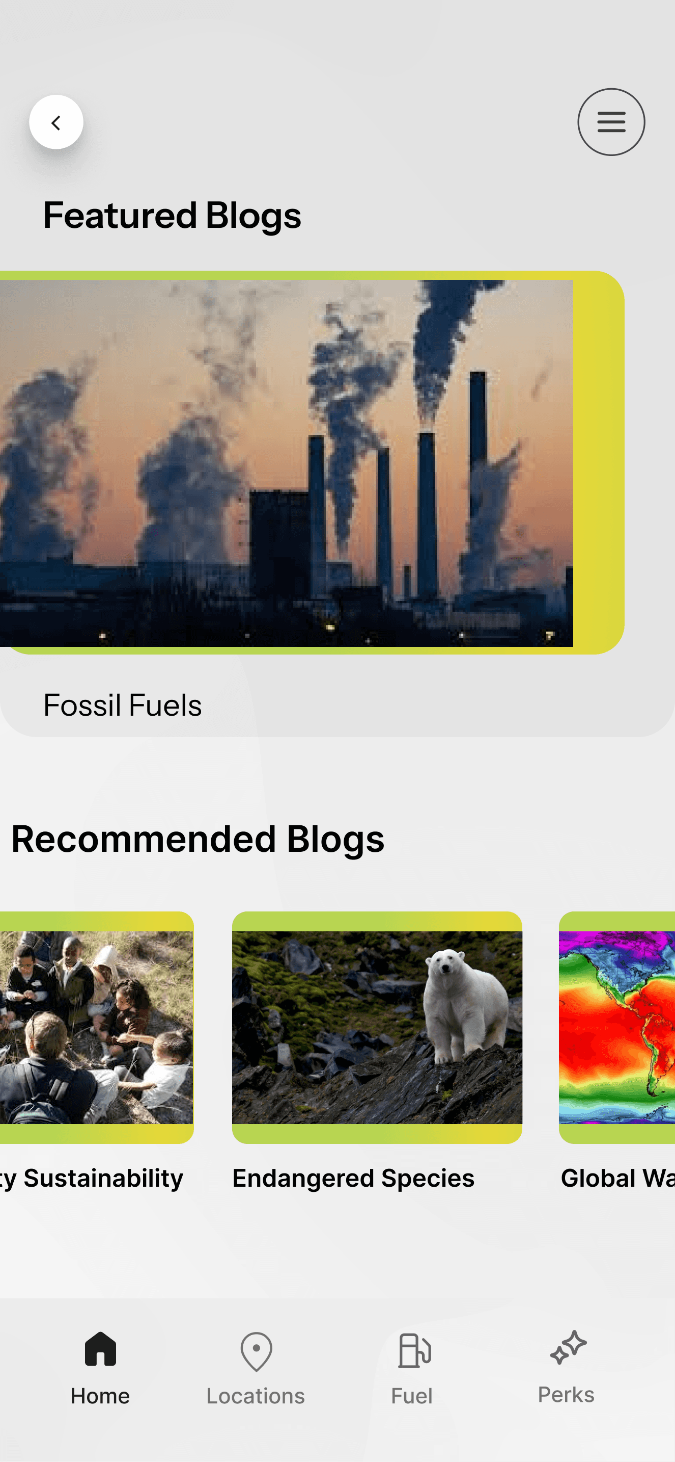
What it is: An eco-hub where users can donate, learn, and understand BP’s importance to sustainability.
What it is: A digital tracker that rewards users after a certain number f in-store purchases.
Why we chose it: Survey data supported that many college students visit gas stations between 5pm to 11pm.
Why we chose it: Gen Z respondents expressed a strong interest in supporting brands that reflect their values.
Why we chose it: Interviewees said reward systems felt too vague or slow; having visible progress solves that.
What it solves: Encourages nighttime store visits by making shopping feel more intentional and rewarding.
What it solves: Builds emotional loyalty and positions BP as a values-driven brand.
What it solves: Makes rewards more tangible, while reinforcing repeat in-store behavior.
Eco Action
Digital Punch Card
Define Features
With our research insights in place and our problem statement ready, we began identifying the core features that would fall under, trust, convenience, and engagement. Each feature was designed not only to solve a specific problem but to create meaningful reasons for users to engage with the app and most importantly, to step inside the store to buy something.
Information Architecture
Having our features defined, organizing the app’s structure was the next step, making sure the user can easily navigate between the eco page and rewards.
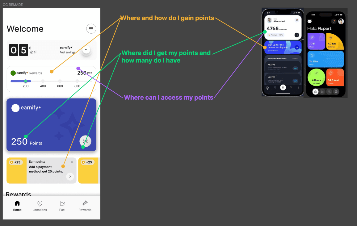
We first reconstructed the current earnify app to better understand where our features can go

Afterwards we constructed our information architecture to compare and better meet the user expectations; only updating the parts relevant to our redesign
Eco Action Button
Shortcut to Perks
Shortcut to Rewards
Highlights drop down
Commitment
At Night: After Dark Deals
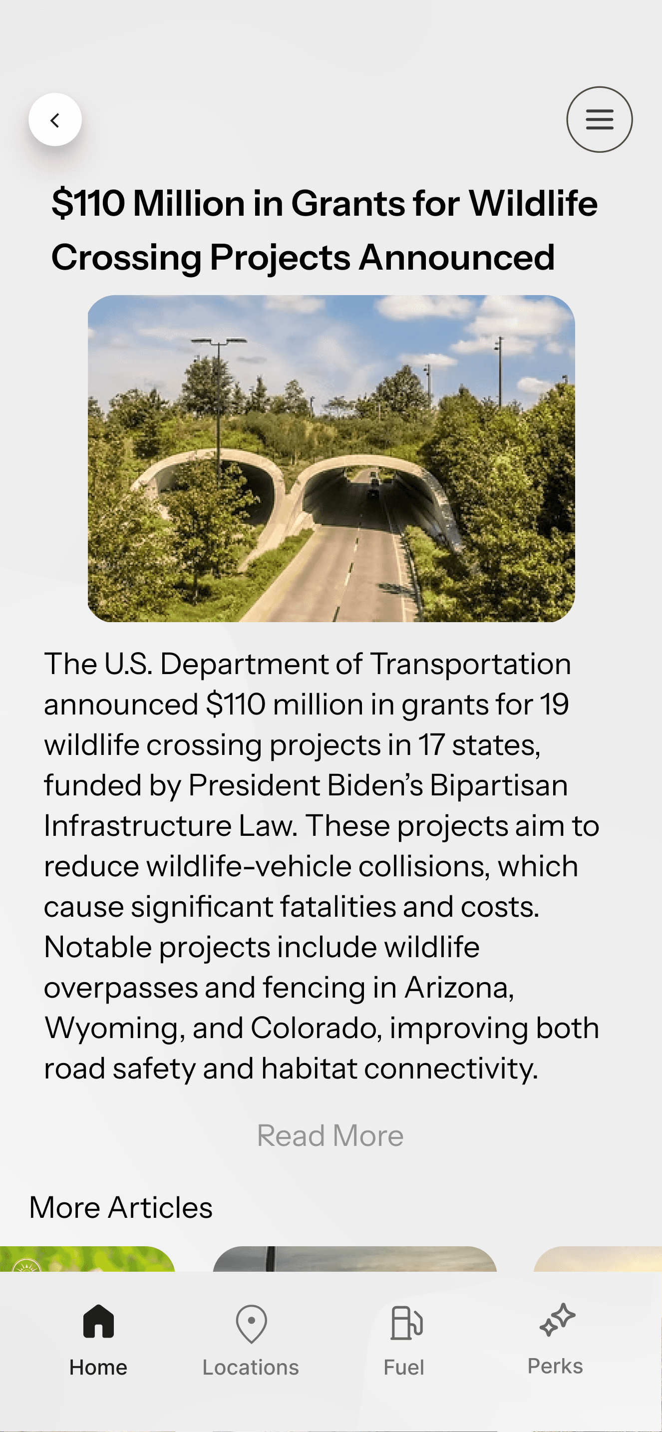
News
Donation
Education
Home
Perks
Deals
Rewards
About
Rewards
Digital Punch Card
04 PROTOTYPE
Bringing our ideas to life through interactive screens
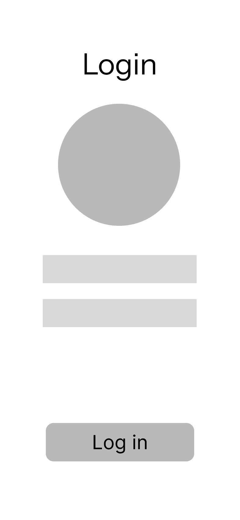
Low Fidelity Wireframes
Putting aside visual detail, we began with low-fidelity wireframes to quickly explore layout and navigation.


Visual Style
We created a visual that stayed true to BP Earnify’s identity while still incorporating new fun ideas to appear to a younger audience


Shapes and Colors
We leaned into gradients and unconventional shapes in the interface to reflect the sense of exploration and discovery we wanted users to feel when browsing the app. These design choices give the app a more playful and dynamic feel that aligns with our reach to young adults.
Usability Testing
We conducted a usability test after creating the first iteration, after getting feedback we drew for more feedback helping us finalize the design
Home screen seems too busy
Digital punch card needs different stamps
Dark mode adjustments
Flexibility of dark and light mode
Structure of the new drop down menu
Unique shapes drew users attention
Pain Points
Positive Feedback
At the end, of 22 people, 72% favored our new design to the original one.
Implementing Feedback

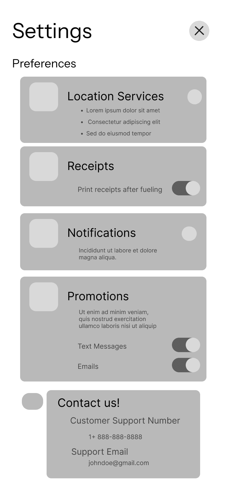
Reduced clutter by adding donation button inside eco action, changing the shape and color of the claim offers button and remove the profile picture from the points card.
BEFORE
AFTER
Changed stamp slots for more visual clarity
Fixed blinding white areas on tabs and sliders


05 REFLECT
How can I improve?
What I learned
Next Step
Research is everything. Even after going through what felt like a long research process I still feel like I could have done more and honestly, should have done more. I recognize that I did put a lot of effort into my research and I’m proud for what I came up with though understanding the micro to understanding the macro is so essential in any project.
Conduct testing on the new features to measure impact on in-store conversions. Usability testing with a working prototype will help validate our new navigation flow and show whether users understand their reward progress.
Team work is the dream work. I’m extremely grateful to work with such a responsive, supportive, and smart team. I pride myself in working well in group settings however this project truly felt like a collaborative effort, taking on different roles, discussing our differences, and coming up with viable solutions together.
Take risks! I was the person who pitched the funny-looking shapes to my team and honestly before that I did not know how they would take it. I just gave it a shot and gave them my reasoning, they understood my ideas clearly and supported my desire to remodel the app with those new shapes and colors.
Dynamic push notifications. Our team discussed having push notifications based on your location to a legible convenience store at specific times during the day, really tapping into our After Dark Deals.